Introduction: Why QGIS Is Still the Best Place to Start in 2026
I still remember the first map I ever made in QGIS. It wasn’t pretty. The colors were wrong, the labels overlapped, and I exported it three times before I realized the scale bar was missing. But that map taught me something important: QGIS rewards practice more than perfection.
Fast forward to 2026, and QGIS has become even more beginner-friendly while remaining powerful enough for professionals working in planning, research, environmental studies, logistics, and education. If you’re here to learn how to make your first map in QGIS in 2026, you’re making a smart choice. You don’t need to be a GIS expert, and you don’t need expensive software. You just need a clear process and a bit of patience.
In this guide, I’ll walk you through the exact workflow I’ve taught to students, interns, and new GIS users over the years. By the end, you’ll understand not just what to click, but why you’re doing it — and you’ll have a map you can confidently export and share.
Understanding the QGIS Interface (Without Overthinking It)
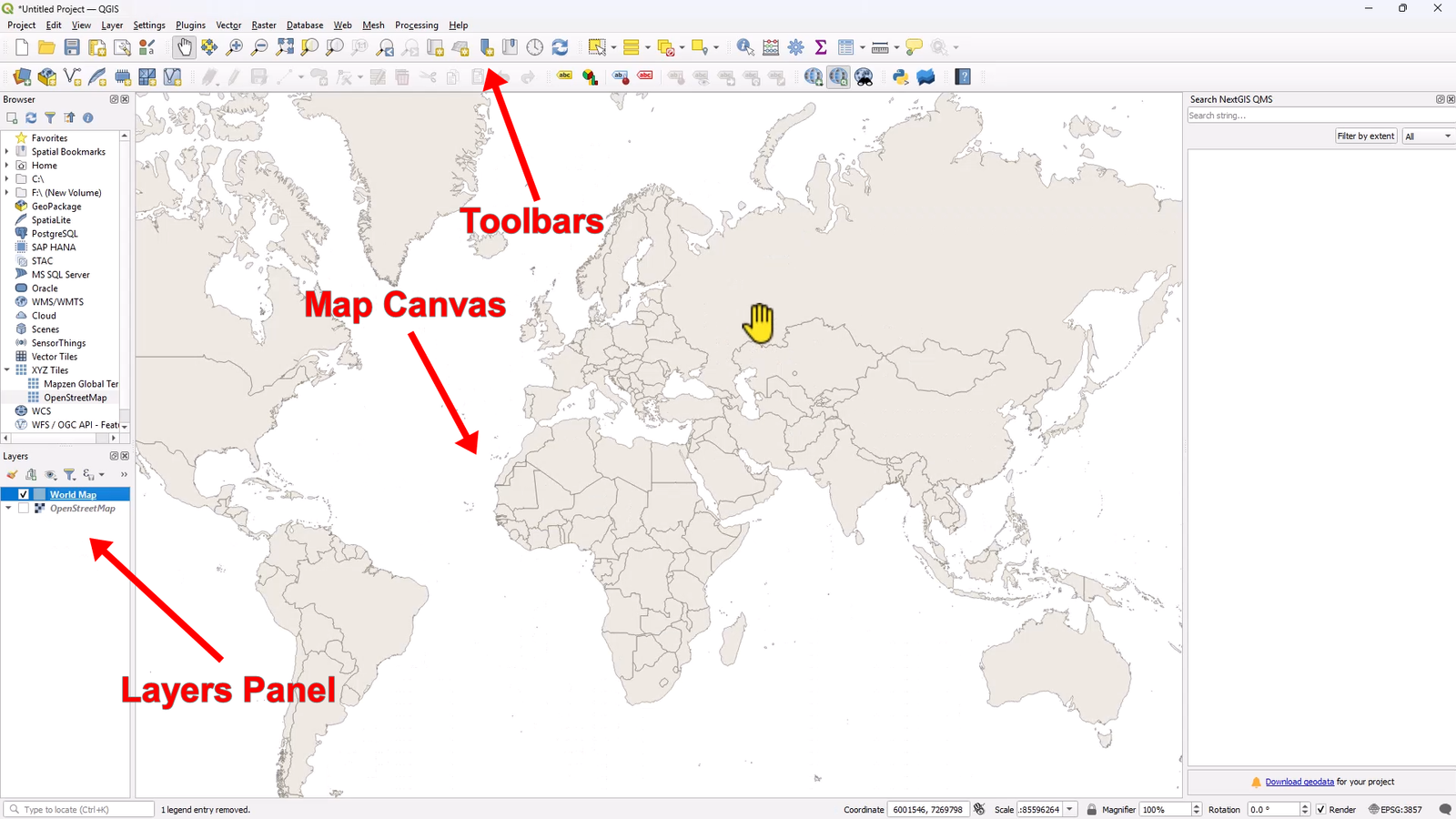
One of the biggest mistakes beginners make is trying to understand everything in QGIS on day one. You don’t need to. When you open QGIS, focus on just three areas:
-
Map Canvas – the large central area where your map appears
-
Layers Panel – shows all your data layers, stacked like transparent sheets
-
Toolbars – buttons for selection, editing, labeling, and layouts
That’s it. Everything else can wait.
I often tell beginners: If you can turn layers on and off, zoom in and out, and right-click a layer, you already know enough to start mapping.
This mindset is essential when learning how to make your first map in QGIS in 2026. The software has grown, but the basics remain simple.
Adding a Basemap and the World Map Shapefile
Every good map starts with context. In most beginner projects, that context comes from a basemap.
Adding OpenStreetMap
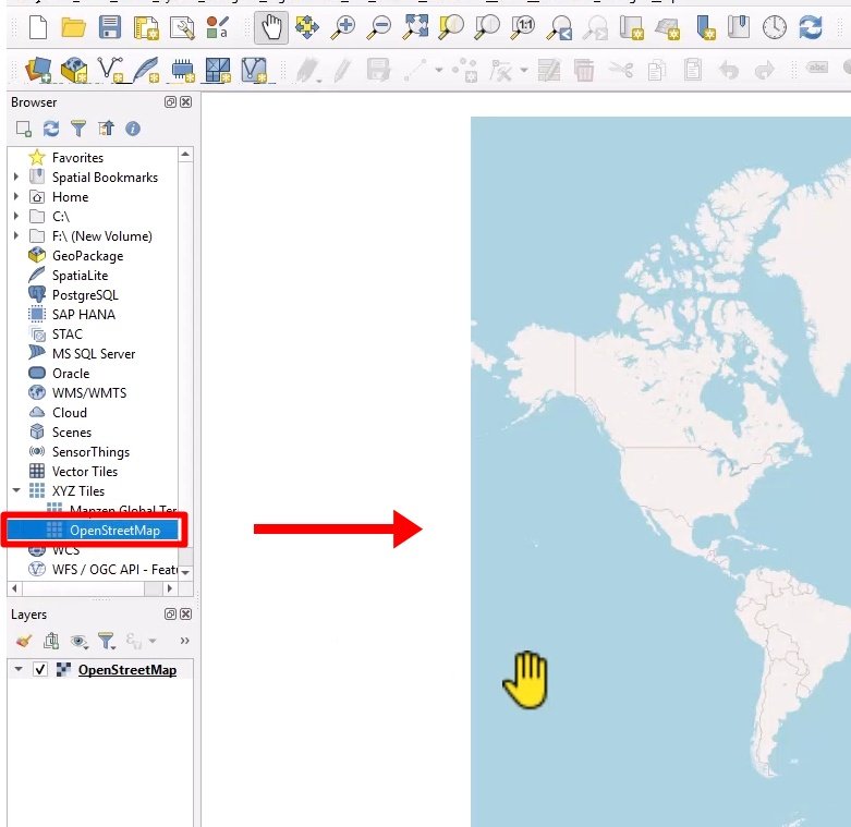
OpenStreetMap is still the most reliable choice for beginners. It gives you roads, coastlines, cities, and landmarks instantly. Adding it helps you orient yourself and understand where your data sits in the real world.
Once the basemap is visible, the map no longer feels abstract. Students always relax at this point — suddenly, QGIS feels familiar.
Using the Built-In World Map Shapefile
One feature I use constantly when teaching is the world map shapefile that can be added directly from the coordinate search bar at the bottom of QGIS.
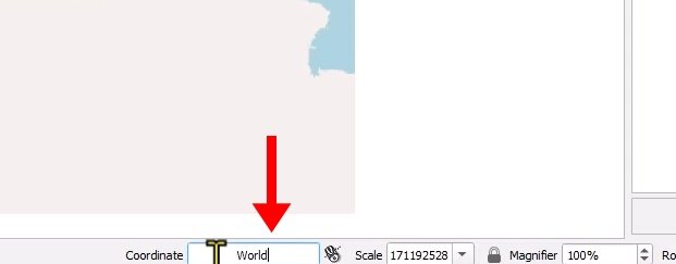
Type “world”, press Enter, and QGIS loads a clean global country layer.
Why do I recommend this?
-
No worrying about projections
-
Perfect for practice and teaching
If your goal is learning how to make your first map in QGIS in 2026, this single step removes a lot of early frustration.
Styling Your Map Like a Professional (Even as a Beginner)
Here’s a truth most tutorials don’t tell you: default styles are almost never good enough.
The moment you add a layer, QGIS assigns random colors. This is fine for testing, but not for communication. Styling is where your map starts to make sense.
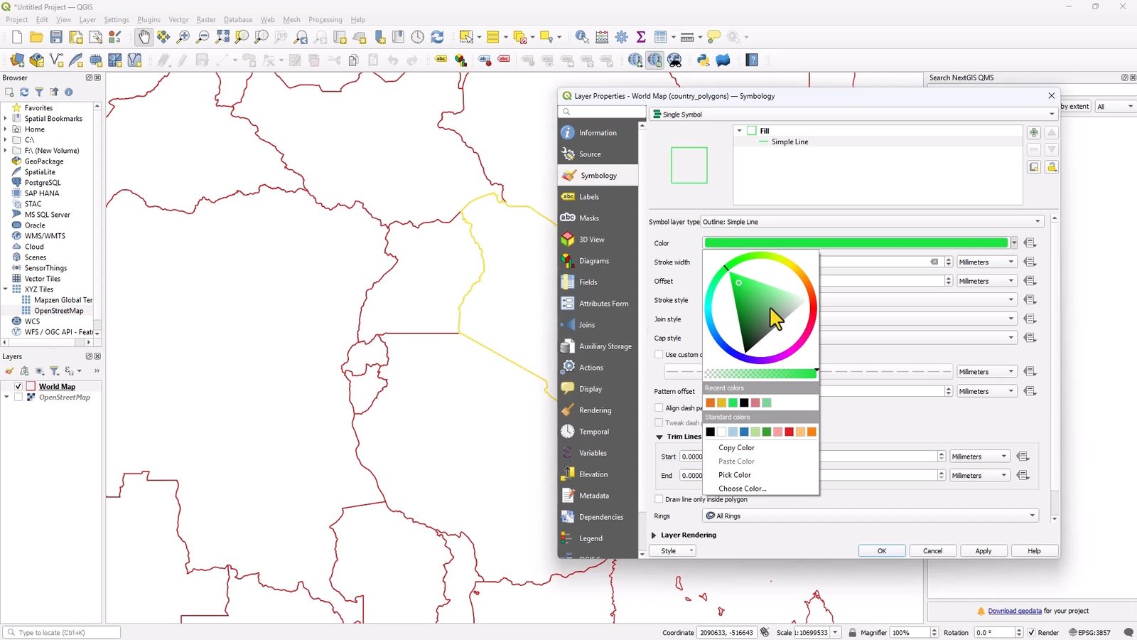
From years of reviewing student work, I’ve learned three simple styling rules:
-
Use soft fills and clear borders
-
Avoid overly bright colors
-
Make sure your data stands out from the basemap
For a world map, I often use a neutral fill color with slightly darker borders. This keeps the focus on selected countries later.
Good styling doesn’t require artistic talent — it requires restraint. If someone can understand your map in five seconds, you’ve done it right.
Adding Labels Without Creating a Mess
Labels are where many first maps fall apart. Too many labels, wrong font sizes, or overlapping text can ruin an otherwise solid map.
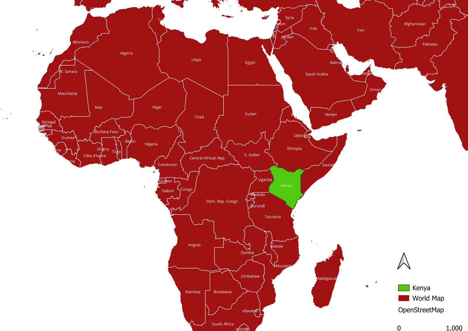
When labeling countries:
-
Use one clear name field
-
Choose a readable font
-
Don’t be afraid to adjust placement settings
A personal tip from experience: labels are optional. If they don’t add value, leave them out. A clean unlabeled map is better than a cluttered labeled one.
This is a key lesson I emphasize when teaching how to make your first map in QGIS in 2026 — clarity always beats completeness.
Selecting and Highlighting Countries the Right Way
This is the step where beginners usually get excited — and for good reason. Selecting specific countries turns a generic world map into a meaningful one.
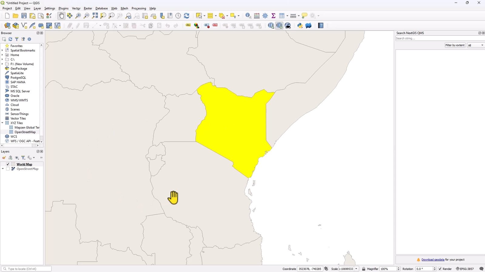
Using the Select Features tool:
-
Click once to select a single country
-
Hold Shift to select multiple countries
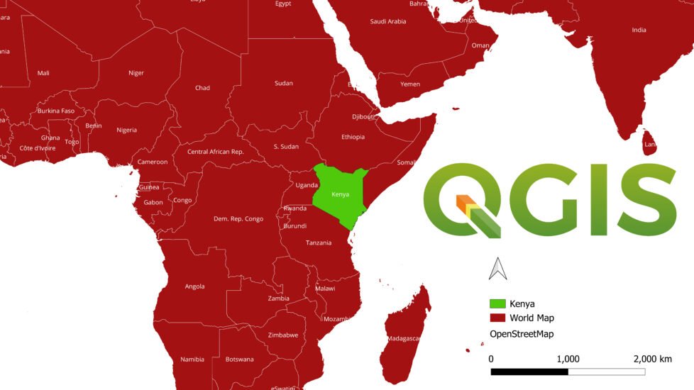
This works beautifully for highlighting regions like East Africa, the European Union, or any custom grouping you want.
Turning Selections Into a New Layer
Here’s a professional trick that many beginners don’t learn early enough:
Once your countries are selected:
-
Use Copy Features
-
Choose Paste Features as New Vector Layer
Now you have a clean layer containing only your selected countries. This makes styling easier, exports cleaner, and your project more organized.
I’ve seen this simple step turn average maps into polished ones. It’s a habit worth building early.
Creating a Print Layout That Actually Looks Finished
A map isn’t complete until it’s in a layout.
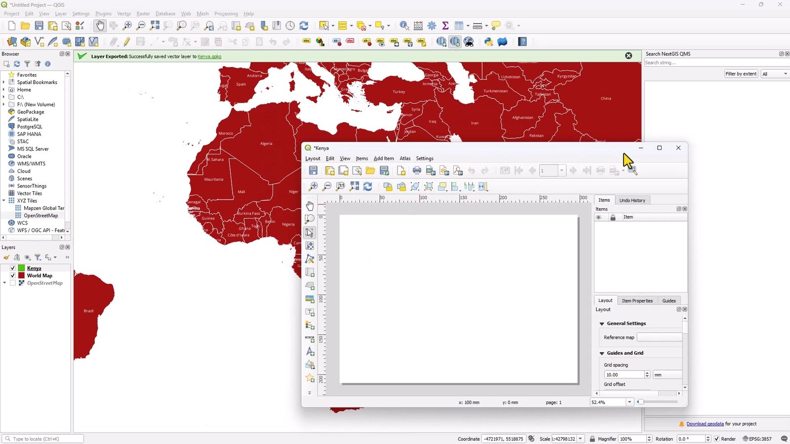
The Print Layout is where QGIS shifts from analysis to presentation. This is where your map becomes something you can submit, print, or share online.
Every finished map should include:
-
A clear title
-
A legend that explains symbols
-
A scale bar
-
A north arrow
I always tell beginners: If someone sees your map without you explaining it, they should still understand it.
That’s the goal of good layout design — and it hasn’t changed, even in 2026.
Exporting and Sharing Your First Map
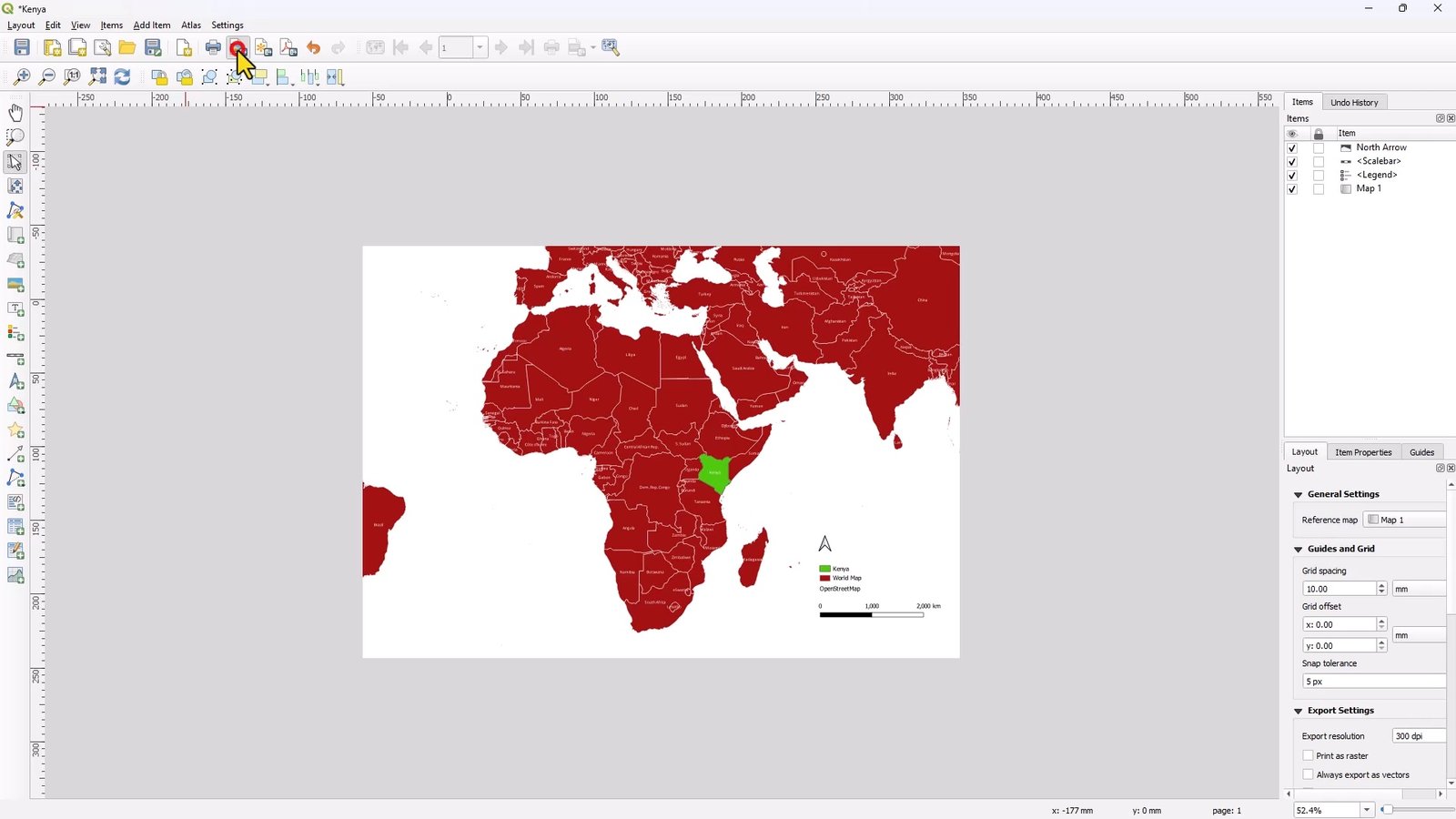
Exporting is straightforward, but it matters more than people think. Choose the right format:
-
PDF for reports and printing
-
PNG or JPEG for presentations and online sharing
Before exporting, do one final check:
-
Are all layers visible?
-
Is the title readable?
-
Does the legend make sense?
That final minute of checking can save you from re-exporting later — trust me, I’ve learned that the hard way.
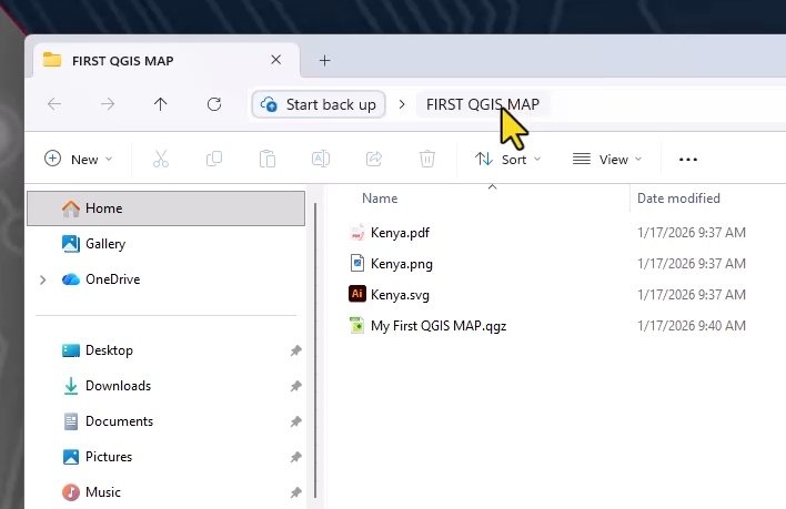
At this point, you’ve completed the full workflow of how to make your first map in QGIS in 2026 — from empty canvas to finished product.
Common Mistakes I See Beginners Make (So You Can Avoid Them)
After years of teaching QGIS, the same issues come up again and again:
-
Relying on default styles
-
Adding too much information
-
Forgetting scale bars and legends
-
Exporting before checking the layout
The good news? Every one of these mistakes is part of learning. Your first map doesn’t need to be perfect — it just needs to exist.
Final Thoughts: Your First Map Is Just the Beginning
Learning how to make your first map in QGIS in 2026 isn’t about mastering every tool. It’s about understanding the workflow:
add data → style it → focus it → present it clearly.
Once you’ve done this once, the fear disappears. Every map after that becomes easier, faster, and better.
I’ve watched complete beginners go from confusion to confidence in a single afternoon — and it always starts with one simple map.
Frequently Asked Questions (FAQs)
1. Is QGIS still relevant in 2026?
Yes. QGIS continues to grow and is widely used in education, government, NGOs, and private industry. Its open-source nature keeps it current and flexible.
2. Do I need programming skills to use QGIS?
No. You can create professional maps without writing any code. Programming becomes useful later, but it’s not required for beginners.
3. What is the easiest data to practice with?
The built-in world map shapefile is ideal. It loads instantly and avoids common beginner issues with projections and file formats.
4. How long does it take to learn the basics of QGIS?
Most beginners can create their first usable map in a few hours. Confidence comes with repetition, not speed.
Rate post

